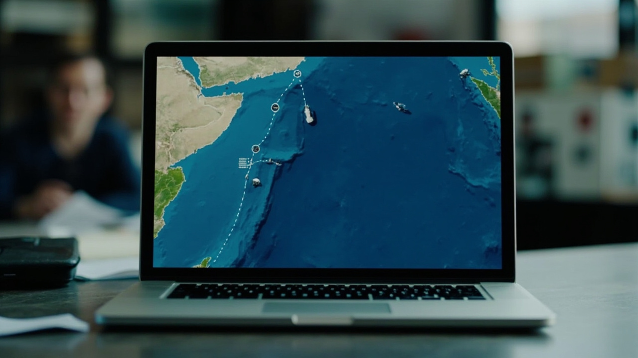
Two of America's largest newsrooms have landed on the same editorial tool at the same time, and the convergence is worth examining. CNN published a video segment titled around how the naval blockade "could decide the war," built around animated maps of the Strait of Hormuz and surrounding waters [1]. The New York Times, meanwhile, has been rolling out interactive map packages that let readers explore blockade positions, shipping lane disruptions, and strike radii in granular detail.
The overlap is not coincidental. Both outlets are investing heavily in visual explainers as a way to translate a geographically complex conflict for domestic audiences. But the framing choices embedded in these maps carry editorial weight. When CNN labels the blockade as something that "could decide" the outcome, it positions naval force as a tool of resolution rather than escalation [1]. When the Times maps Tehran's vulnerability to air corridors, it invites readers to see the war through a planner's lens [2].
Media scholars have long noted that cartographic journalism shapes perception as much as it informs. The choice of what to label, what to animate, and what to leave off the frame all carry implicit arguments. In this case, both outlets are converging on a shared narrative: the blockade is leverage, and leverage is how wars end.
Whether that framing serves readers or policymakers is the question neither map can answer.
-- MAYA CALLOWAY, Los Angeles